A common mistake in all kinds of colour printing - reversal or C-type - is to use a colourful original as the basis for your test prints. Areas of saturated colour can be so strong that they do not show any visible shift when fairly large filtration changes are applied, and it is in the nature of human vision that adjacent colours affect each other.
You can check this out very easily by cutting a couple of holes about one centimetre square in card. One hole should be cut in black card, the other in white (a fully fogged and developed sheet of paper will do very well - you just turn it over).
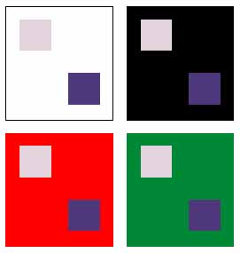
Place this aperture over a patch of colour with the black surrounding it; now replace it with the aperture with white surrounding it. You will see huge apparent shift in the saturation and brightness of the patch of colour. It is very hard to colour balance a tone like dark navy fabric, khaki or plum when viewed against white. All these tones will look fairly similar. View them against black and their differences in hue become perceptually far greater.

The color patches here look different depending on whether they are viewed on a light, dark, or contrasting colored background
This effect of viewing color against a black or white ground is echoed in similar shifts of apparent color which happen throughout a typical color picture. A green field looks different in color when there is a blue sky above in place of plain white, even if the green in measurably identical. Skin tones look visually different when seen against a blue backdrop or a brown backdrop, and if you demonstrate this effect by cutting out a couple of matched reprints and putting a face on to a number of different colored cards, you can begin to see why particular colors are most popular as studio backgrounds.
A final factor is that color vision is variable - not only do people have different failings and strengths in their own color perception, but this changes with age and can be strongly influenced by ambient light, time of day, and what you have most recently been looking at. Anyone who drives a car with heavily bronze-tinted windows will be painfully aware of this on getting out into the clear blue light of day!
It is possible to be tested for color matching ability - all the staff at Icon have taken a test, and fortunately no-one proved to be color blind. In fact, everyone was surprisingly above average, which is a good thing in photography. Heredity may not have much to do with it as Shirley's ability was exceptional, while Richard's (son) was the least accurate. It is not unusual to find lab staff who turn out to have identifiable color vision deficiencies much worse than any of us!
So, when selecting your negative or slide to set up filtration standards, you should be careful to avoid multi-colored, saturated, interesting shots or skin tones against strong colors. Try to select an image with mainly neutral tones, with a grey card if possible; have skin tones showing not against white or black, but against a neutral midtone; and be sure to include some neutral pastels or quarter-tones, because it is in the lighter areas of prints that casts are most noticeable.

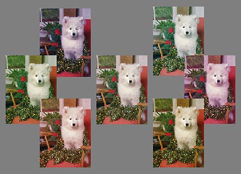
A test ringaround showing the effect of a 20 unit shift in each primary color direction, round a neutral corrected central print
Having secured what you consider to be a neutral print, make a ring-round to pin up in your darkroom. This can be as complex as you want - dozens of prints in combinations of 5CC filter shifts, or just a simple set of six prints with a 20CC shift applied to each one (C, M, Y, R, G, B). You then use your judgment to assess whether 5, 10, 15, 25, 30 or 35 units are needed, the 20CC shift providing a fairly strong �medium' bias.
Mount these on a neutral grey board - the exact grey is not critical but matching a Kodak grey card makes a good starting-point - because, once again, a colored background like cork tiles or a biased background like a white wall will influence your judgment.
Finally, equip your viewing area (or darkroom) with fluorescent tubes intended for daylight matching. Natural or �colorite' tubes are probably better than Northlight, but a good choice today is the kind of tube used in the Scandles lighting heads - Philips 95, 5300K, available in 24w 4-pin to fit special holders. Just be sure not to use an ordinary domestic fluorescent tube or tungsten bulbs. There's no substitute for a well-lit area near a window for actual daylight assessment, but remember your prints may ultimately be lit by tungsten in a display window or gallery, and if this is the case you may choose to balance them by the same light they're going to be seen under.